Monday, 17 October 2011

upcycled utility.

The brief of this assignment was to use the JCDecaux posters to show the essence of the material, and with that in mind, I wanted to explore how far I could take a simple strip of the material. The slight stiffness yet ample flexibility of the material allowed me to naturally twist it to form elegant figures, and I used that to my advantage. I began by looking at more nature inspired shapes, such as the subtle twists of vines, and that lead me to looking at floral patterns. I also did some research into lamp shades, and drew inspiration from how they draped, and I wanted to recreate something similar from strips.

There were problems I ran into, as I first did experiments with paper, and the polypropylene was slightly different, both in texture and in weight, so I had to alter my design many times. There were also problems regarding how the lamp had to flat packed, and that narrowed down my ideas further. I had to do multiple experiments as I used a metal ring, and the tension of the strips together made the material more rigid than I intended it to be. I wanted a free flowing, draping design, so to keep the idea I had in mind, I changed the actual size of it to allow the material to show its natural form.

Finally I can say that my final design combines the natural curve of the material, with the ability for it to twist into elegant shapes. It is a ceiling light, large enough to be seen from a distance, and when stood underneath of, there are multiple flower patterns made through gentle twists. It is all held together with a simple silver ring, because it is both chic and modern, adding a minimalistic touch to an already full light design. Looking at the light straight on, it is very reminiscent of a lamp shade, the drapes adding a new modern touch. 

Concept Poster.
Assembly Instructions.
Autocad Cutting Template.

Five peer assessed comments, links and names are below:

Tuesday, 27 September 2011

bill moggridge.

What is design?

In the latest video I watched, Bill Moggridge explores the definition of design. He defines design as anything altered by man, and thus alludes to how broad design really is. There is no one category of design, but rather, it design itself branches out to reach the fashion industry, interior shapes and even engineering. From architecture, to industrial design, to interior design, Moggridge really covers many interesting aspects, focusing on design principals in this 55 minute video.

First Moggridge introduces us to both good and bad design. There is a segment where he discusses kitchen tools, and how they are categorised as “smart design”. This is because the kitchen utensil is easy to use, even for older people, people with arthritic hands. He draws attention to how a good design to the disabled is also good design to others. The example shown of bad design was the mention of the i-mode service. This service is used for purchasing soft drinks with mobile phones, and whilst some may marvel at the ingenuity of it, the designers didn’t cater for their target market, and thus, didn’t adhere to their needs. There were several issues with it, some of which included the long processing time and the confusing nature of it. Judging from a designers perspective, there was insufficient prototyping done before this was released, and there may have been miscommunications during the design process too.

This leads Moggridge to discuss the design process and its concepts. There are two main concerns. The first being understanding the consumer, and the second being prototyping. To understand people, there are three categories: people (desirability), business (viability) and technology (feasibility). To fully understand a consumer, all three of these branches must be put forward for thought. Moddridge concludes his explanation of the design process with an overview of the four things we must do and that is; to assess the flow of analysis, observe, ask and to experiment. The other half of the design refers to prototyping. There are three stages to prototyping; inspire, evolve and to validate. The constantly evolving technology in today’s world allows for easy simulations of designs, showcased on computer in its 3D form before even needing to construct a physical model. However, it is important that a physical model is made at some stage to examine all areas and to make adjustments.

Bill Moggridge also covers three expanding contexts relating to design. This would be the Personal, Social and Environmental aspects, each a crucial part of any designers mentality. Design is expanding towards the well being of people and their health, hence this heavily concentration on living more sustainably. Personal design concentrates on the consumer themselves. Social refers to the design for impact, to change something for improvement. Environmental looks at how the materials the object is made up of affects our world.

This video was very entertaining to watch and I loved hearing the design process being broken down into categories. It really helped me to understand the whole notion of design, as opposed to what a designer does. 

Monday, 12 September 2011

project 1 - spatula

My redesign of a spatula allows the user to comfortably explore their love for food, whether it is pancakes, eggs, rice or vegetables. The handle of the instrument is made of recycled plastics, adhering with the latest theme of living in a more sustainable lifestyle. It is ergonomically fitted to a variation of hand sizes, and is curved and rounded gently on all sides, thus creating a very minimalistic, yet comfortable and stylish grip. The head of the handle is curved to a set radius, to then connect with the flip of the spatula, in a well blended seam to reinforce the style of the tool. The flipping part of the spatula is made of stainless steel, for a smooth, non-stick cooking experience. The choice of stainless steel is due to its material qualities, it is one of the best materials to use due to its durable but light nature and the immaculate finish it gives. The recycled plastic handle is both user friendly, but also serves to reinforce being more environmentally friendly, even in situations such as our own kitchen.

The spatula is designed to be used in many environments, from the home kitchen to industrial, restaurant kitchens, to street side stalls. Its slightly curved handle mimics the actions of flipping an egg or pancake, thus encouraging the user to do so comfortably. The symmetrical nature of the spatula is designed to adequately encourage both left and right handed usage. My design has combined the points of a visually appealing instrument, with those of an ergonomic feel. The design also leaves options for the mass manufacture of this spatula. Through the successful choice of material and design, this spatula enriches the experience of cooking, making it a pleasurable hand tool to use.


Autocad Technical Drawing.
Concept poster/Hero shot.
Product Usage Storyboard.
--x--


I have also peer assessed five students, all links and names below.

Monday, 22 August 2011

annie leonard.


This week I watched 3 videos by Annie Leonard:

The story of cosmetics:
The first one I watched was the story of cosmetics. As a female myself, I own quite a lot of beauty products, hair care, skin care, make up, the lot. When Annie talked about what was actually in those products, it got me thinking. Did I really know what ingredients are in my eye-shadow? Do I really know what products are in my own shampoo? These days everyone is looking for a cure for cancer yet all these chemicals are ‘linked’ in some way to cancer. The point that Leonard bought up was very interesting; it put a spin on the priorities the cosmetic companies sees, both in our health and in the safety of our health. It’s well known that the first priority for a business is profit, but is it really worth it at the risk of everyone’s health?

The story of bottled water:
Water, something that comes out of our taps, something you drink daily, something we have the luxury of not worrying too much about. Annie Leonard’s video on bottled water was eye opening, I knew the prices of bottled water were raised up significantly, but to say that the price was jacked up 2000% was definitely surprising. I had already known from previous research that our ‘recycled’ bottles were actually shipped to India, however Leonard brought new light to it by describing it as ‘mountains of plastic bottles’. I have to agree that the pictures on the bottles are misleading, however you could say that it is a marketing scheme that any company would be guilty of. As industrial designers, we should be thinking of cleaner ways, leaning towards a more sustainable lifestyle. Consuming plastics at our rate, and not doing enough to recycle or reuse them will be a major factor in the near future.

The story of stuff:
Design for the Dump – something that designers are very aware of these days. Annie Leonard describes it as a marketing technique, in which companies and designers create newer, more advanced models and in turn we neglect our older models and things – thus designing things to be thrown away. Industrial designers should realise that a standardisation is necessary, not just for common things like usb ports, but larger scale things like laptop chargers. If it was a universal standardisation, not only would we be saving valuable resources, but there would be no need to constantly upgrade what we already have. Making common parts for electronic gadgets alike should be a move that the world all moves towards. I think this video shows that we need to think towards the far future, not just in the short scheme of things because at this rate, our world is going to consist of landfills in every country.

Wednesday, 17 August 2011

product sketches.

These are some of the sketches i've done after visiting the powerhouse museum with some friends on the weekend.


Sunday, 14 August 2011

my design career.

     Design has always been an integral part of my life as I was growing up because both my parents worked in the fashion industry. It only seemed natural that I would develop my creative talent as I grew older, and this was evident in the classes I took in primary school. I always loved art: drawing, painting, sketching and was never without my colouring pencils. This all began from the way I was raised. However in high school, my classes became more academic and I neglected my creative side. After four years, I realised what I really wanted to do, and it was some form of design where I could let out my creative spirits.

     As a child I was open to the world of fashion design as my mother was a seamstress. She would make seemingly scraps of material into beautiful garments and I was mesmerised. She had worked for leading fashion labels such as David Jones, Manning Cartell, Kirrily Johnston and many other smaller Australian boutiques. I remember as a child I would sit in her workroom and use scraps of material to make my own clothes for my dolls and teddies. I was the kind of child that could be trusted with scissors and needles because I learned the techniques from a young age. Coupled with that, my father also worked in the fashion industry for over ten years, with leading swimwear brands such as Speedo and Seafolly, so I was constantly surrounded by fashion design.

     I saw from a very young age that the design process is more than the average person believes it to be. There are many steps taken, and many areas are revisited in order for the creation of a final product. It is both tedious, but rewarding. I believe it was sometime during high school that I decided I wanted to be a designer of some sort, so I started researching the types of university courses out there. Industrial design was something new to me, I hadn’t heard of anyone who had done the course earlier, but when I read the course outline I was intrigued. I loved the idea of recreating products to make them more aesthetically pleasing and being opened to a world of different materials.

     Industrial design was only offered at a handful of universities, and I already had my heart set on entering UNSW from a young age. Thus the choice to study industrial design at this university wasn’t a very difficult decision to come to. However when the course began, it was nothing like my expectations. Fundamentals in particular dissolved all prior beliefs to what a designer was, and I believe all the students started on a fresh and even slate. Thus far, the course has been engaging and interesting, I’ve enjoyed all my units and I’m looking forward to what the others bring.

     The future is something that I’m anticipating. I believe industrial design isn’t my only option, and I’m looking forward to embracing other branches of design as well. Graphic design has also been an interest of mine for some time now, and I think that it’s worthwhile to invest some time into studying that as well. The only thing I know now is that I do want a more hands-on career and will embrace design, albeit the late nights and designers-block.

Monday, 8 August 2011

Design confusion.


So that's my poster for design confusion. I got gifted the iDog by a friend, and if i didn't have the instruction manual, i wouldn't have guessed how to get full use of the functions!

Tuesday, 2 August 2011

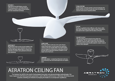
design excellece: product poster


Just looking at the Aeratron fan i can appreciate all the curves and thought gone into the process. It wasn't until i had to gather research about it that i realised there wasn't very much information out on the internet. The images were all very small and required a lot of digital enhancing, or in the case of the logo; i had to redraw it from scratch. However with that being said, the fan itself is beautifully structured and the shape and texture of it just adds to a sense of serenity.

Monday, 1 August 2011

David Kelley: human centred design


David Kelley discusses how he went to TED annually without fail, and over time he’s seen a progression towards designing for the consumer rather than for the designer. He reminiscences on how some products or objects, particularly technological products were displayed, and gives his viewers an explanation of how they were showcased under black cloths on conference tables. This was his introduction into a focus on products and he demonstrated with a slideshow of previously designed objects, and how some have become ubiquitous in recent years such as his example of the heart defibrillator.

The last 18 years have been revolutionary in the design world because people have begun to focus on what humans want, an approach to designing behaviours and personalities into products and in turn have made a designers job even more enjoyable. Designers used to build 3d models and 3d renderings to communicate their ideas but now larger firms have altered objects to make it more unique, particularly through internal video production groups to make experienced prototypes between man and machine.

The first video was Prada’s innovative take on environmental design – consisting of technology in their retail stores. They wanted to focus on both a cultural role and a retail role, thus customising things instead of buying them right off shelves. There was a scanner developed, so a sales associated could scan a clothing item in, and it would then be displayed on screens around the store, the item of choice shown on runway models, regular people or even allowing different sizes and colours to be listed. This Prada store also included a liquid crystal display in changing rooms – allowing clear glass doors to transform into a blurred surface. Their changing rooms were also customised with a “magic mirror” that would show the subject turning with a three second delay to allow customers to see the back of the garment on them. All these changes were made to create a more personalised touch to a retail experience and this is where designers are headed towards.

Another example that David Kelley introduced his views to, was the whole conceptual idea of a cubical space. Once known as just a drab office area, a team decided to revamp it and conduct research on what would make a more inviting, and fun work space. Their research was a fun take on including human behaviour into a still object, and they succeeded in designing an area which was both appealing to the eye, and suitable for an innovative office space.

Today the new design process is more centred towards the consumers’ senses, and in reality including behaviours and personalities into a product. Designers are more trusted and integrated into the design process than ever before as it brings new innovative methods for creating and designing.

Sunday, 24 July 2011

don norman.

In the following video Don Norman discusses emotional design and the way that it affects a consumer. Emotional design is an issue designer’s face when developing the needs and wants of a consumer. Don Norman quotes that it can be broken up into three different emotions: visceral, behavioural and reflective – and I found this particularly engaging to watch. As he has said, most of our feelings are subconscious and it has made me realise that our subconscious is the agent that spurs our emotions, our actions and our thoughts, and now – design.

The first level of emotional design that Don Norman discusses is visceral imagery, that is: deeper inward feelings evoked through a particular design, rather than the intellectual choice of object. He uses examples such as the choice of font, colour preference, and the basic physic of an article to demonstrate that the subconscious mind plays upon our existing knowledge. This is further explained by his recap of tests that a particular psychologist (Alice Ison) conducted on patients – analysing how fear affects their attitude in a situation. It leads onto how certain designs can also evoke such emotions – and how designers, or any regular patron acts in a situation. Industrial designers should pay particular attention to what we call the “first impression” test, and that is the conclusions of what their subconscious minds jump to at the sight of an object.

Another level of emotion design that Don Norman explains is behavioural, and that is in regards to ones physical actions towards a design. Basically behavioural refers to how the design functions towards its intended market. For example, an object could make someone feel intimidated through its large boxy nature, or it could encourage relaxation, due to its rounded shape. Our minds, through analysis has shown that we are more attracted to certain shapes/textures for reasons due to our childhood, or life experiences and Norman explains this in the video.

The last level of emotional design explored is reflective – and that is the contemplation that consumers have after viewing or buying the object. This is the emotion that causes one to either love and hence keep an object for many years, or have it replaced after its time usage. The video skims over ‘storytelling’, but with each object, there is a story behind it. This is often why people keep things for many years rather than having it as a makeshift replacement until a better design a found. The reflective nature in consumers thus forces them to compare designs until they find one that is most suitable to their tastes and needs.

Overall the video has led me to think about what I’ve bought due to its design appeal rather than its function. The world today has many designs for a single function, and it’s up to us consumers to decide which one fits our uses best. However due to so many designs, we now gravitate towards those which are more visually appealing and that has led to a revolution of designs in the world.

Tuesday, 19 July 2011

start of sem 2.

Hello people (: We're back at uni now. Tralalala. So much work T_T

xx

Wednesday, 1 June 2011

design passport.

A photo of my design passport. Hopefully its readable, otherwise i'll type up the answers (:
xx

rest away.

Our animation project was due today and it was super nerve racking. As we had rest we were lined up to go last - which was both a good and bad thing. Good: being that we didn't have to present so early, and Bad: meaning we got to view everyones crazy pro videos before it got to ours. Needless to say our nerves were pretty shot but we went ahead and played it.

What i've learnt:
What i see on my own computer monitor, is not the same as it viewed on a projector blown up to 30x the size.

When we rendered and edited the video, the images were a lot more crisp, but because of our chosen screen resolution it was quite blurry and slightly out of focus. I thought it added to the 'restful' theme but i guess not. Hm.

Well, if you want to watch the video, here's the link for it below.


Anyway, i'm just glad it's all over and done with now. We kissed goodbye to design fundamentals and although it was hectic, i surprisingly still had heaps of fun! Looking back, our learning curve was super steep but it was actually a good thing.

xx

Tuesday, 31 May 2011

product history tree.

So we were asked to create a product history tree that traced back a choice of consumer technology products. I chose the gaming console because i've always enjoyed games from a very young age. However, research led me to the first atari and magnavox models - and they were something i didn't have very in depth knowledge of so it did teach me quite a bit.

I chose to do my poster in illustrator because with simple lines and vectors, it gave my poster a more crisp look and fit the theme of a more playful nature.

It's not super detailed in terms of word length but the pictures and logos should be enough to work out where the tree is going and the developments along the way. I chose to keep it devoid of colour to keep the essence of the work.
xx

Monday, 30 May 2011

stapler.

Comm A assignment. I did a stapler (: It actually didn't take as long as i thought it would - but then i realised i made several mistakes and had to fix it up. Oh wells.
Overall image screenshot.
I like my springs :D

xx

Thursday, 26 May 2011

piranesi.

Oh thank the lord. Piranesi is finally done and over with. All in all i think i spent around 40 hours on it - half the time the tutors actually suggested we would need. It was around 35 hours of pure drawing awesomness and 5 hours of planning and design. They said it would be one of our most satisfying assignments ever and i have to agree! Only thing i'm kind of peeved off about is that i got it professionally mounted and guess what!? There are bumps on it already! They didn't glue it down properly. Grrr.

Anyway i did my drawing based on a map of a station - it was supposed to be central, but the feeling wasn't quite right. So instead i just wrote all the signs in Hindi - ahaha the words just look cool.

Half finished - still looking kind of bland.
The finished product! Yay (:
Anyway that's all for tonight!
xx

Saturday, 21 May 2011

finders keepers.

Today i went finders keepers. For those who don't know what it is, its basically a design exhibition/marketplace to welcome upcoming designers and works. It was pretty good i gotta say - there were things from jewellery to furniture to lighting to fashion. There were lots of different takes on original ideas, e.g. a cardboard, self illustrated chair.
That is all :D
xx

Saturday, 14 May 2011

the perfect small apartment chair.

I was on yanko design today when i came across a post about a chair. My eyes seem to be naturally drawn to chairs these days as that's what we spent a good time studying in fundamentals haha. It was called 'the perfect small apartment chair' because it folds to be an armchair, a stool or a footrest in a matter of seconds!

Design is beautiful.
xx

Monday, 2 May 2011

powerhouse.

Earlier this year i visited the powerhouse museum and although this wasn't whilst i was in uni, it was still recently enough that i can remember it vividly. All i can say is that i now view products differently to what i did before. I care more about the design process, and how its gotten to its final stages of production rather than directly judging it by face value.

The powerhouse museum had a variety of exhibitions but i mainly focused on the industrial design section.
I think what this course has taught all of us, and i mention design fundamentals in particular, is that there's a lot more to everything than meets the eye. -Nods-
xx

Tuesday, 26 April 2011

paper at its best.

In the last couple of weeks, we've had to made paper models for Fundamentals - and i must say, i've learnt a lot about planning for steps ahead, drawing out ideas, and the physical restraints of paper. I was pretty pleased with how my paper models turn out, but after watching this video, i feel so ashamed.


From the Top Speed website:
Sometimes there are things that defy rhyme, reason, or any sort of explanation. You just stop thinking and appreciate the work for what its worth: a kick-ass piece of art. This project is one of those things.
Graphic designer, Taras Lesko, is known for possessing a pretty artistic set of hands, having gained fame for some of his elaborate works made out of paper. But his latest work is defined not just for the intricate work done on it, but also for its general awesomeness.
Using 285 pieces of printed pages of card stock and 750 laser-printed parts detailed and rendered in flattened wood pulp, Lesko was able to piece together a mind-boggling 4 ft x 2 ft x 2 ft scale model of the Audi A7. The finished product is nothing short of amazing, and the elaborate work wasn’t isolated on the exterior too. Even the A7’s interior, complete with the infotainment system, was carefully crafted to make it look like the real thing.
It’s one hell of a work of art, if you ask us. To see how Lesko was able to piece the whole project together from scratch to finish, check out the three-minute time-lapse video of Lesko build his Audi A7 masterpiece.
And from what we heard, the whole project was commissioned by Audi of America and judging by the finished product, we’re pretty sure that the people who asked Lesko to do this are pretty happy with how it turned out.

Saturday, 16 April 2011

postcards - collab.

So our postcards were all due a couple of days back. And i just have one word to say - wow. Who knew that postcards could be so awesome. I saw some amazing ones when we all lay it out on the tables to see. Like i said before, our group did Martin Place and i think our groups' post cards worked together really well. There weren't any that stood out from the group and we all followed a strict colour scheme so that really helped.

In our postcards we explored lines, texture and placement. Because we were a group of girls we even incorporated cosmetics into our post cards (i.e. foundation, mascara, eyeliner) but we also used techniques such a coffee drawing (?), sandpaper cutouts and newspaper backgrounds.

So behold, our collaborated artwork:
Arranging the postcards in a nice order.
Sticking the postcards onto our foam core with blu-tack.
Our mounted masterpiece 1.
Our mounted masterpiece 2.
Can you guys guess which ones i did?
xx

Sunday, 10 April 2011

alvar aalto.

As part of fundamentals, i've been studying my assigned designer 'alvar aalto' and his designs. At the beginning, i didn't understand his theory, or his designs, but after the last 4 weeks, i think i've now grown to love him. His designs, while simplistic, oozes sophistication and i can only hope to replicate a tad of that in my designs. Below was what i presented a couple of days ago.
My entire Designer Project.
3D relief.
3D model.
Poster, paintings, patterns.
Yep so this is the result of 4 weeks of hard work in one unit. Or one part of a unit i should say lol.

Saturday, 2 April 2011

my piggy.

Yesterday was supposed to be my day off (free fridays!), but i trekked it to uni to get a headstart on my surface & structure assignment. It was surprising to see so many people from our course there even though we all live quite a distance away - but that just made the work more fun and enjoyable!

Here's a sneak peak at the drawings for my pig. I'll probably have to redo them later because its not technically in "3rd projection view" but whatever, it works for now.
My piggy bank in paper form (:
After i was done at uni, i trekked it out to martin place for my second round of photo taking. I had to capture the essence of martin place at a particular time of day and i got 6pm-9pm so i got a few nice sunset pictures. I didn't stay til dark cos i figured there wouldn't be much to see anyway lol.

Sydney hospital.
Sunset colours 1.
Sunset colours 2.
Sunset colours 3.
I know it might be like stating the obvious to some, but the difference between martin place on the weekends, and at 6pm on a weeknight is staggering. I know the photos don't show it, but there were so many business people hanging around, and the underground pub/bar place was completely packed! It was a good insight into a place i don't usually visit.
xx